


Out of the hundreds of thousands of fonts in existence, few have managed to become as infamous as Comic Sans. On its own, the font might seem innocent enough, if a bit tacky, but the font has garnered such a reputation that simply Googling its name shows mostly people making fun of it. When explaining what makes Comic Sans so unpopular, people usually fall into one of three categories: they believe either that the font is innocent and its misuse is irritating, that the font was just ugly to begin with, or they are reacting to its prevalence on the internet as a meme font.
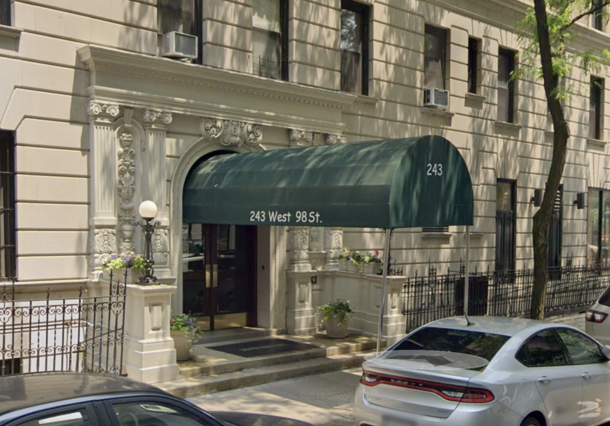
The misuse argument is the simplest one: most people who use Comic Sans don’t understand its purpose or intended audience. The font was designed in 1994 by Vincent Connare to be used for the dialogue of a cartoon dog in Windows 95. It was meant to be seen by children and to look playful and imperfect, especially as opposed to the cold formality of Times New Roman. However, most users were not aware of this very specific intended use, and the font’s easy availability on Windows enabled its use in many places far from playful in tone. The font became ubiquitous — from awnings to holocaust memorials, Comic Sans inserted itself where it didn’t remotely belong.

However, while Comic Sans is definitely used where it doesn’t make sense, the complaints about it extend beyond its misuse. The almost-but-not-quite handwritten look can almost evoke the uncanny valley — the uneasy effect caused by an object being close to but still clearly not human.
This strange look is exacerbated by inconsistent kerning — the spacing between letters. Well-kerned fonts have letters that look consistently and naturally spaced, but unfortunately, Comic Sans is not one such font. While its imperfections may be intended as part of the handwritten look, they are not always effective and can instead look sloppy.
The spacing between N/a and a/s look uncomfortably close while the spacing between i/t and f/e look awkwardly far apart.

Image by Phoebe Fried
The opposite problem applies to the line thickness: whereas inconsistent kerning makes Comic Sans look awkward, too-consistent line weight makes the font look manufactured. From a distance, the places where lines meet within characters can look darker because of this. The result of unintentional darker-looking spots in letters is a blobby, disorganized appearance from afar, rather than the charming, semi-handwritten intention.
Comic Sans’ reputation today resulted from the reaction to its overuse and misuse combined with its uncanny qualities. People got frustrated seeing it everywhere, and complaints about the font have never really stopped. Comic Sans is now infamous for being misused and oftentimes criticized for its misuse. There have been two main responses to the overwhelming complaints about Comic Sans: attempting to defend it and turning it into a meme.
In defense of Comic Sans, it is often argued that these features — the poor kerning, too-consistent line weight, and general weirdness — may actually be a good thing. Ironically, the very attributes that make Comic Sans look weird may also make it good for learning because of the disfluency effect.
The disfluency effect is a phenomenon where text that is harder to read (“disfluent”) leads to greater retention. The irregularity of Comic Sans means that it potentially has this effect. In a 2009 study conducted by Oppenheimer et al., high school students in Chesterland, Ohio were taught using disfluent fonts, including Comic Sans Italicized. With the exception of chemistry, the results showed that all classes taught using disfluent fonts had improved student test scores. This study is frequently cited as evidence that despite its troubled reputation, Comic Sans might not be so bad after all.
However, multiple similar studies since then have struggled or been unable to replicate this effect. One study, conducted in 2021, was unable to replicate the disfluency effect in Comic Sans. The authors of this study give a potential explanation: “We understood Comic Sans as a disfluent font, which may have been incorrect.” The disfluency effect is an enticing defense of ugly fonts, but it is unclear as of yet whether disfluent fonts do increase retention, or, if they do, if Comic Sans is disfluent enough to have that effect.
The other most common defense of Comic Sans is that it is supposedly more legible for people with dyslexia. The British Dyslexia Association even recommends it in its style guide. However, this claim is difficult to substantiate. There has been very little research investigating accessible fonts for dyslexia that specifically studies Comic Sans. Rather, Comic Sans gets lumped into the group of sans serif fonts that tend to be more readable. A 2013 study on fonts that are good for dyslexia mentioned several sans serif fonts, none of which were Comic Sans, as “good fonts for people with dyslexia,” and noted that the sans serif font group is generally better for reading performance. Being sans serif, Comic Sans is probably better for dyslexia than most serif fonts, but other than anecdotal evidence, there is little reason to use it over any other sans serif font.
The other response to Comic Sans’ wild unpopularity, its memeification, is much more straightforward. After the inordinate upset over something as relatively inconsequential as a font meant for small children, people realized that using it was a perfect way to annoy those who cared too much. Consequently, it once again rose in popularity, especially on the internet. As an anonymous HSMSE student put it in a poll conducted by The Echo, “it’s a nice troll font.”
In this poll, 60 members of the HSMSE community answered the question “Do you like Comic Sans?”, followed by a brief explanation. The results show that the font is indeed very controversial — 50% of responses answered that they dislike it, 33.3% that they like it, and 16.7% that they don’t care. Explanations ranged from “it’s funny” to “It just looks… bad. It’s hurting to my eyes, AND WHY IS THIS IN COMIC SANSSS!!!!!!!” (referring to the poll being written in Comic Sans). Interestingly, one student explained that they dislike it because “It’s a meme font 😭”. To summarize, this is a response to the meme response to the criticism of the overuse of Comic Sans — this opinion has four layers of explanation.
At this point, it’s hard to believe this all started with a cartoon dog on Windows. Like it or hate it, Comic Sans has somehow managed to have a greater impact on our culture than any other font in history. However ugly it might be, that is a truly impressive feat; Comic Sans deserves respect.